Overview
HeyMath!'s web dashboard — Lumos — was the command centre for teachers managing their classes. But teachers don't work only from desktops. Between periods, in the staffroom, during parent meetings, they needed the same insight they had at their desk. The HeyMath Teacher App brought the core of the Lumos dashboard to mobile — optimised for the speed and context of the staffroom and corridor, not the classroom workstation.
As the sole designer on HeyMath products, I led the full UX design for this mobile companion — translating the information architecture of the web dashboard into a touch-first, on-the-go experience.
The Problem
The Lumos web dashboard was powerful but anchored to a desk. Teachers who were mid-lesson, moving between classes, or in a parent meeting had no way to quickly pull up a student's recent performance or check whether assignments had been submitted. They had to wait until they were back at a desktop to act on information they needed now.
The challenge wasn't to port the full dashboard to mobile — that would produce an unusable wall of data on a 5" screen. The challenge was to identify the right subset of actions and information that made sense in a mobile, on-the-go context, and design them for fast, one-handed use.
"During parent-teacher meetings I have to open my laptop, log in, wait for it to load — by then the conversation has moved on. I need the answer in 10 seconds, not 2 minutes."
Research & Discovery
Research drew on years of teacher insight accumulated through the Lumos project, supplemented by specific mobile-context interviews. We focused on one question: what does a teacher need to do when they're away from their desk?
The mobile jobs-to-be-done
"Check in on my class" — Quick scan of who's active, who's behind. Summary metrics, not drilled-down reports.
"Find out about a specific student" — During a parent meeting or corridor conversation, look up one student's recent performance without needing to navigate a full reporting interface.
"Assign something quickly" — Assign a practice set before the next lesson without going to a desktop. A mobile-optimised assignment creation flow that cut the web flow from 7 steps to 3.
"See what's due" — Check upcoming assignment deadlines across classes. A calendar-lite view answering "what do I need to be ready for tomorrow?"
Design Execution
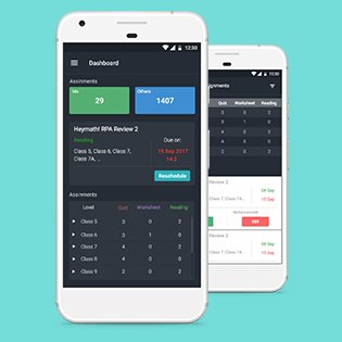
Home screen — the 10-second brief
Designed the home screen around a single "Today" card — one view showing active students now, assignments due this week, and any students flagged as at-risk. Everything a teacher needed to start their day briefed in under 10 seconds. No tab-switching, no navigation required to get this snapshot.
Student lookup
A persistent search bar gave instant access to any student by name or class. The student detail view surfaced: recent activity, assignment submissions, performance band, and any teacher notes. Designed for one-handed scrolling — the most important information above the fold without requiring a tap.
Quick assign
Streamlined the assignment creation flow from 7 web steps to 3 mobile taps: Select class → pick lesson or set → confirm. Date defaults to "due tomorrow" (the most common choice in research). Teachers could push an assignment to a class in under 30 seconds.
Navigation model
Four tabs: Home, Classes, Students, More. Tabs chosen based on frequency of use data from the web dashboard — these four accounted for 92% of teacher actions. The "More" overflow prevented over-tabbing while keeping the interface within thumb reach for one-handed use.
Outcomes
The app was adopted rapidly by teachers who had previously used Lumos only from desktops. The student lookup and quick-assign features saw the highest engagement, validating the research hypothesis about the core mobile jobs-to-be-done. Teachers reported using the app during parent meetings as a live reference tool — the scenario that had originally motivated the brief.
Learnings
Subsetting is not simplifying. Designing a mobile companion is not about removing features — it's about identifying the right features for the right context. The teacher needed the same data, just surfaced through a mobile job-to-be-done lens rather than a desktop efficiency lens.
One-handed design is a discipline. The discipline of designing for one-handed thumb reach changed the layout decisions throughout the app — navigation at the bottom, primary actions within the lower third, secondary information scrollable rather than above the fold.
Consistency with the web creates trust. Because the data and information architecture mirrored Lumos, teachers could switch from web to mobile without re-learning. Familiar patterns built confidence in the mobile experience immediately.