
Overview
HeyMath! had a strong web presence for students — animated maths lessons, assignment submission, and performance reports. But students don't do all their studying at a desk. The HeyMath Student App was designed to bring the same learning experience to mobile — accessible on the bus, during free periods, or at home on a shared device without a desktop.
This was a ground-up mobile design challenge: the web platform was rich and desktop-optimised. Translating it to mobile required rethinking every interaction from the student's perspective, not the platform's structure. As the sole designer on HeyMath, I owned this project end-to-end.
The Problem
Students using HeyMath on the web were tied to school computer labs or home desktops. In markets like South Africa, Malaysia, and India, many students had smartphones but no reliable desktop access at home. This created a gap: the platform had content that could help students, but they couldn't reach it in the moments when they most needed to study.
A secondary problem: the web platform's information architecture was built around a school year and curriculum structure — logical for teachers and admins but intimidating for a 10-year-old who just wanted to do their homework. The student experience needed to be personal, motivating, and simple without being patronising to older students.
"I want to do my assignment but I'm on the bus. My laptop is at home. By the time I get back it's too late."
Research & Discovery
Research for the student app required a different approach — working directly with students (ages 8–16) alongside their teachers and parents. The age range created a design tension: an interface appropriate for an 8-year-old would feel childish to a 15-year-old, and vice versa.
Core findings
Students want to feel capable, not tracked. The most emotionally resonant feedback was about how the platform made students feel. Progress bars and scores created anxiety. A sense of "here's what you're doing well, here's what's next" was far more motivating than a raw percentage.
Assignments drive mobile sessions. The primary trigger for opening the app was an assignment notification from a teacher. The assignment-to-submission flow was the most important sequence to get right — if it was confusing or broken, students would switch to WhatsApp to ask a classmate instead.
Notifications are the entry point. Push notifications for new assignments and approaching deadlines were the primary driver of opens. The notification design and the landing state after tapping a notification had to be immediate and actionable.
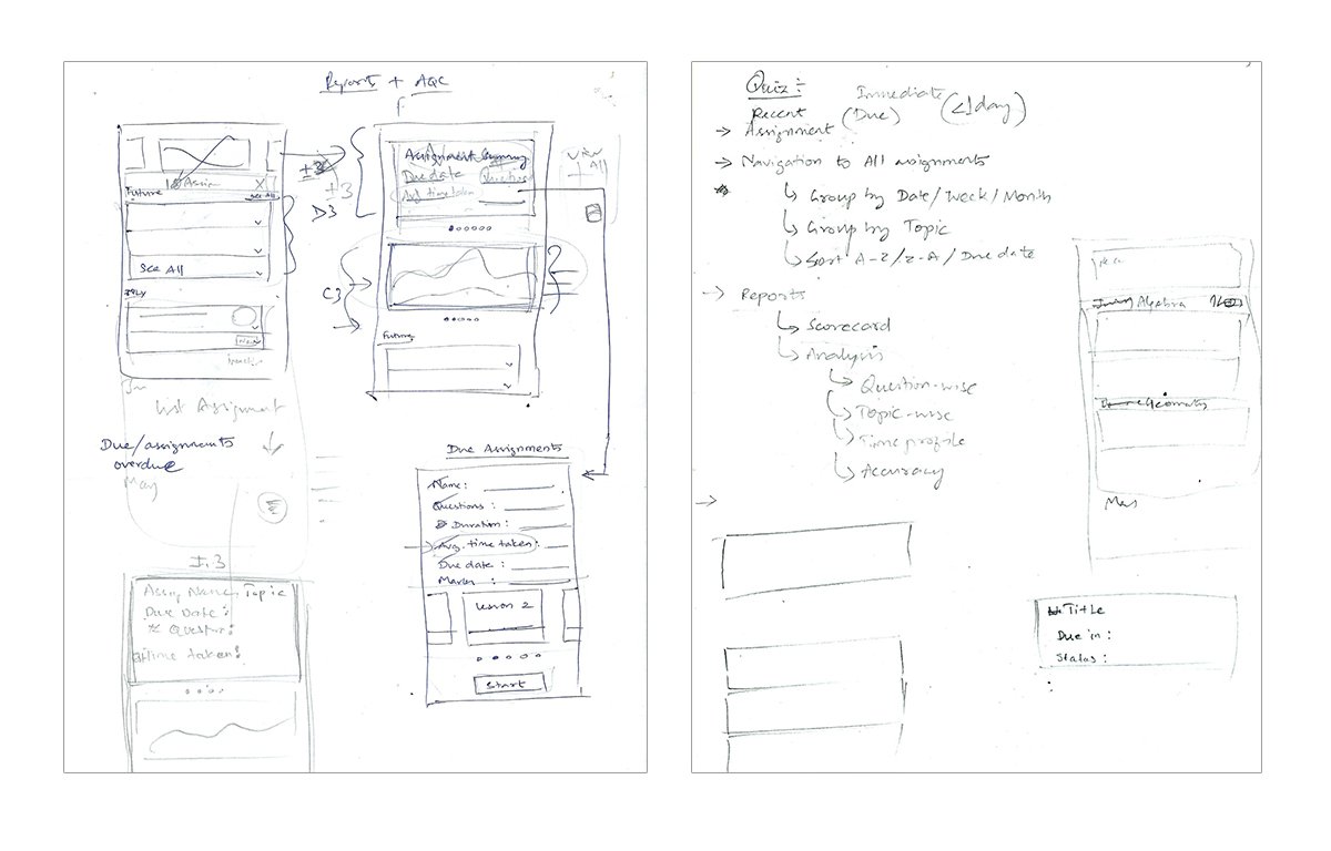
Design Execution
Home screen — "Today for you"
The home screen was built around three cards: "Assignments due", "Continue learning" (resume where they left off), and "Achievements this week". The framing is student-centric — what do you need to do, what did you start, what did you accomplish — rather than admin-centric.
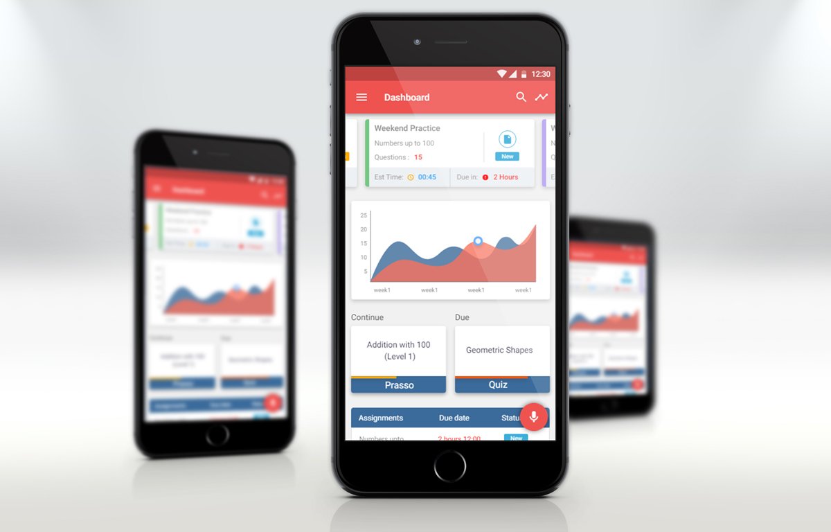
Lesson experience
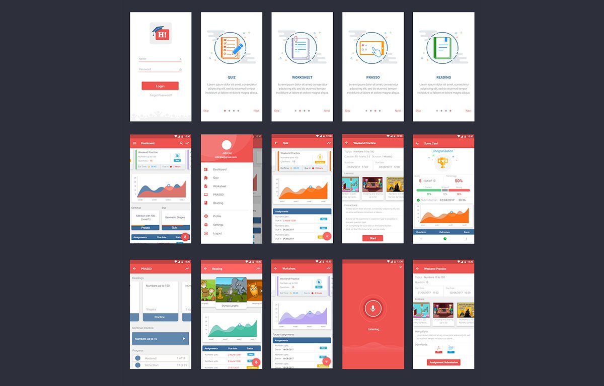
HeyMath lessons used animated video with embedded questions. The mobile design required a full-screen video player with chapter markers — students could replay any segment, and questions were surfaced inline rather than after the video, maintaining the interactive learning loop. Answered questions were marked without interrupting the video flow.
Assignment submission
Designed for the complete submission flow on mobile: open assignment → attempt questions → review → submit. Question types included multiple choice, numeric input, and image-based problems. Built accessible tap targets (minimum 44px) and clear state transitions between "Not started", "In progress", and "Submitted".
Progress & achievements
Replaced the performance score with a topic-mastery visual — a simple radial display showing which curriculum topics had been practised. Students could see they were strong in some areas and growing in others. Weekly streaks (consecutive days of practice) provided a lightweight motivation layer without gamifying in ways that felt manipulative.
Age-adaptive typography
Designed a typography scale that could be set by the school or parent — "Younger learner" mode used larger type, more colour, and simplified language; "Older learner" mode was more compact and text-forward. This avoided the need for two separate apps while respecting the emotional needs of each age group.
Outcomes
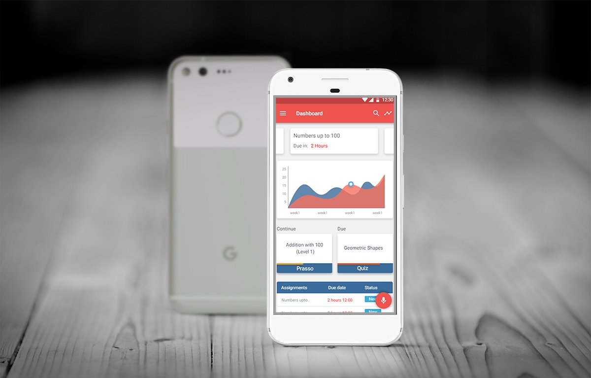
The student app saw strong engagement particularly for assignment completion — the primary use case. Students in markets with limited desktop access used the mobile app as their primary HeyMath interface, validating the hypothesis that mobile access was unlocking learning time that was previously unreachable by the platform.
Learnings
Designing for an age range is designing for multiple users. The 8-to-16 span is enormous developmentally. The adaptive typography system was a compromise — not perfect for any single student, but far better than a one-size approach that alienated either end of the range.
Emotional design is not decoration. The shift from "score" to "here's what you're growing in" was a substantive UX decision that changed the emotional experience of using the platform. Students who felt capable were more likely to return. That's a retention strategy, not just a feelings strategy.
Notifications are a UX responsibility. The notification-to-task flow is a journey. If a student taps a "You have a new assignment" notification and lands on a home screen that doesn't immediately surface that assignment, the notification has failed as a UX touchpoint. End-to-end journeys start outside the app.