Overview
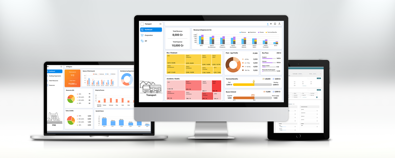
The Tamil Nadu Government Performance Management Dashboard (GPMD) is a state-scale data intelligence platform built for the Chief Minister's Office of Tamil Nadu. It brings together performance data from over 40 government departments — Transport, Agriculture, Public Works, Mines & Minerals, Education, Police, Health, Finance, and more — into a unified, real-time decision-support system used at district, regional, and state levels.
As Lead Designer at Peninsular Research Operations, I was responsible for the full design of the platform — from the system architecture and information hierarchy through to every department dashboard, the data visualisation language, and the design system that powered it all. The dashboards are deployed on large-format screens in government offices, including the Tamil Nadu Secretariat.
The Problem
Tamil Nadu's government departments each operated with radically different technology maturity levels. Some had no in-house data systems at all. Others ran legacy platforms built over decades. A few used modern APIs. None of them talked to each other — and none surfaced data in a way that was useful for senior decision-makers at the CMO level.
The Chief Minister's Office needed a single view of state performance — a real-time command centre that could answer "where are we against target?" for any department, any metric, at any administrative level, at a moment's notice. The challenge wasn't just data aggregation — it was designing clarity out of enormous, fragmented complexity.
"The data exists somewhere. The question is: can we see it clearly enough to act on it — today, not next week?"
Core design challenges
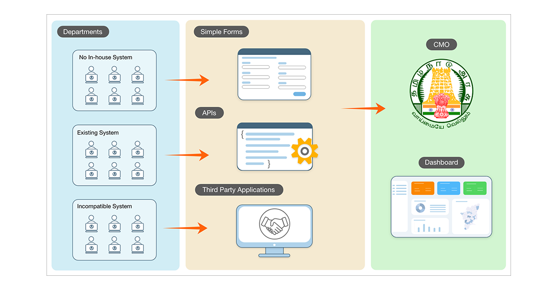
Heterogeneous data sources: Departments without existing systems needed simple data-entry forms designed. Those with existing systems needed API connectors. Incompatible legacy systems required third-party data adapters. The design had to work across all three integration paths without exposing that complexity to end users.
Multi-level information needs: A district collector, a regional commissioner, and the Chief Minister's Office needed the same underlying data at completely different levels of aggregation and analytical depth. One interface could not serve all three — but one design system had to.
Visualisation diversity: Each department's data was structurally different. Water resources needed reservoirs and rainfall maps. Mines & Minerals needed lease counts and revenue by mineral. Education needed enrolment curves and learning outcomes. A single visual grammar had to stretch across all of them without breaking.
Large-format display context: Many dashboards were designed to be viewed on conference room screens from across a table — not on a desktop monitor at close range. Layout density, typography sizing, and contrast all required calibration for this context.
Research & Discovery
Research for a project of this scale was as much about understanding government processes as it was about user behaviour. I worked with department stakeholders across multiple rounds of workshops to map what data existed, what decisions it needed to support, and what the mental models of different officer levels looked like.
Stakeholder mapping
CMO level (State): Senior IAS officers and the Chief Minister's staff needed an instant cross-department pulse — which departments were on track, which were lagging against annual targets, and where intervention was needed. They needed summary first, with drill-down available but never forced.
Secretariat level (Region): Department secretaries and commissioners needed comparative district-level data within their domain — progress against budget utilisation, scheme completion rates, and target-vs-actual performance across multiple sub-metrics.
District level: Collectors and district officers needed hyperlocal data — their district's status on specific schemes, pending approvals in the process flow, and actionable flags for bottlenecks requiring their attention.
Key insight
The most important research finding was that the bottleneck was never the data — it was the confidence to act on it. Officers knew their department's performance intellectually; what they lacked was a visual, credible, always-current representation that they could cite and act on in real-time review meetings. The dashboard had to become the source of truth in the room — which meant it had to be undeniably clear and visually authoritative.
Data Architecture & Integration Design
Before any screen could be designed, the data integration model had to be resolved. Departments fell into three categories, each requiring a different ingestion path into the central platform.
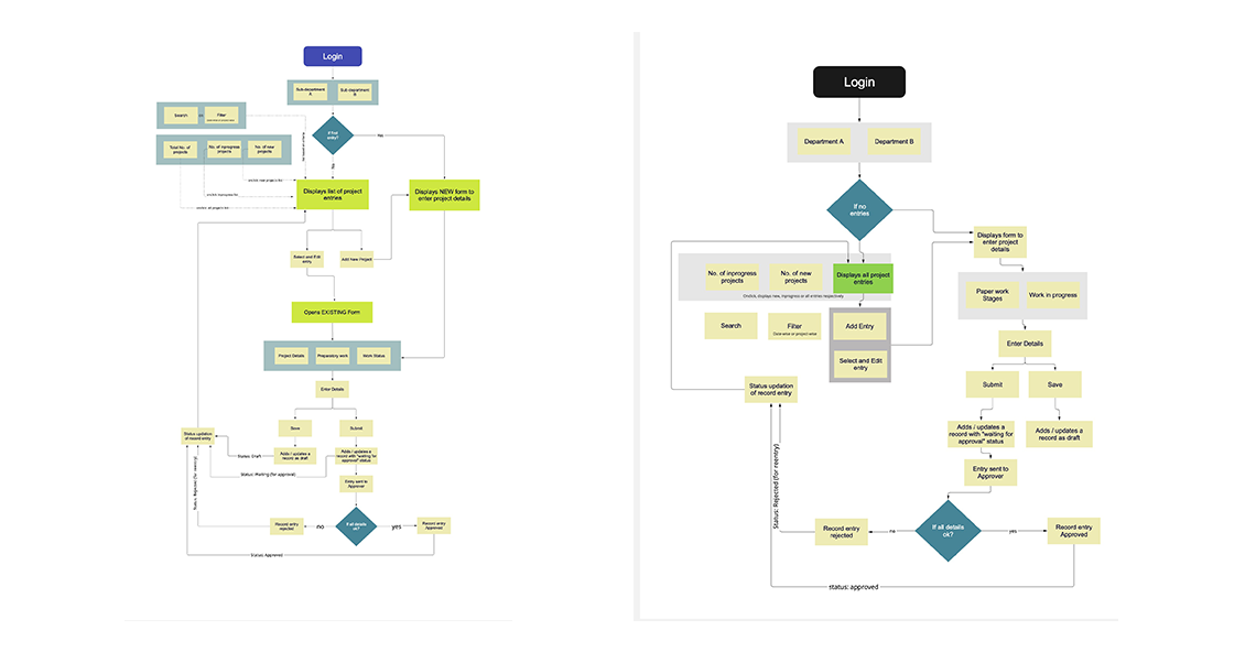
No in-house system: For departments with no digital data infrastructure, I designed lightweight data-entry forms — simple, minimal, and optimised for non-technical departmental staff to update metrics on a regular cadence. The form design prioritised confidence over completeness: a short, guided form completed consistently beats a comprehensive form completed intermittently.
Existing systems with APIs: Departments that had modern systems with data APIs were integrated directly. The dashboard pulled live data on a defined refresh cycle. My role here was purely on the visualisation and presentation layer.
Incompatible legacy systems: The most complex case — departments with data locked in proprietary legacy platforms. These required third-party data adapter design, where I worked with the engineering team to define data schemas and specify transformation logic, while designing the abstraction layer that made the output look as clean as a native API feed.
The output of all three paths was a unified data layer feeding the CMO dashboard — invisible to the end user, but critical to the architecture.
Information Architecture & Structure
The master IA decision was to build a two-layer hierarchy: a central dashboard hub (a visual catalog of all 40+ department dashboards) and individual department dashboards. Each department dashboard then had its own internal information hierarchy based on that department's specific data model and user needs.
The hub: Dashboard catalog
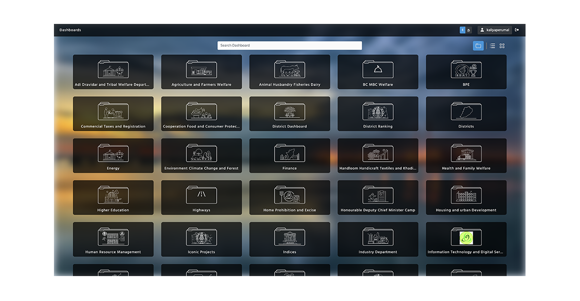
The landing experience — the dashboard hub — shows all departments as a grid of named, icon-led cards. Officers navigate to their domain, and the hub gives leadership a single-screen inventory of the entire state's data assets. The grid layout supports search and filtering, allowing fast access in high-pressure review settings.
Department dashboard structure
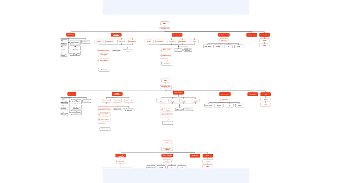
Each department dashboard followed a consistent structural pattern: a regional scope selector at the top (All Regions → Chennai → Trichy → etc.), KPI summary tiles above the fold, and detailed charts and breakdowns below. This meant a user could get the headline answer in 5 seconds and drill into the detail only when needed.
Role-based access model
The navigation structure changed based on login role. State-level officers saw all regions with roll-up totals. Regional officers saw their zone's districts. District-level officers saw hyperlocal data for their jurisdiction only. The same screens, the same visual language — three different data scopes. The design never exposed the role-switching logic; it simply surfaced what each officer could act on.
Design Execution
Dashboard hub — the master catalog
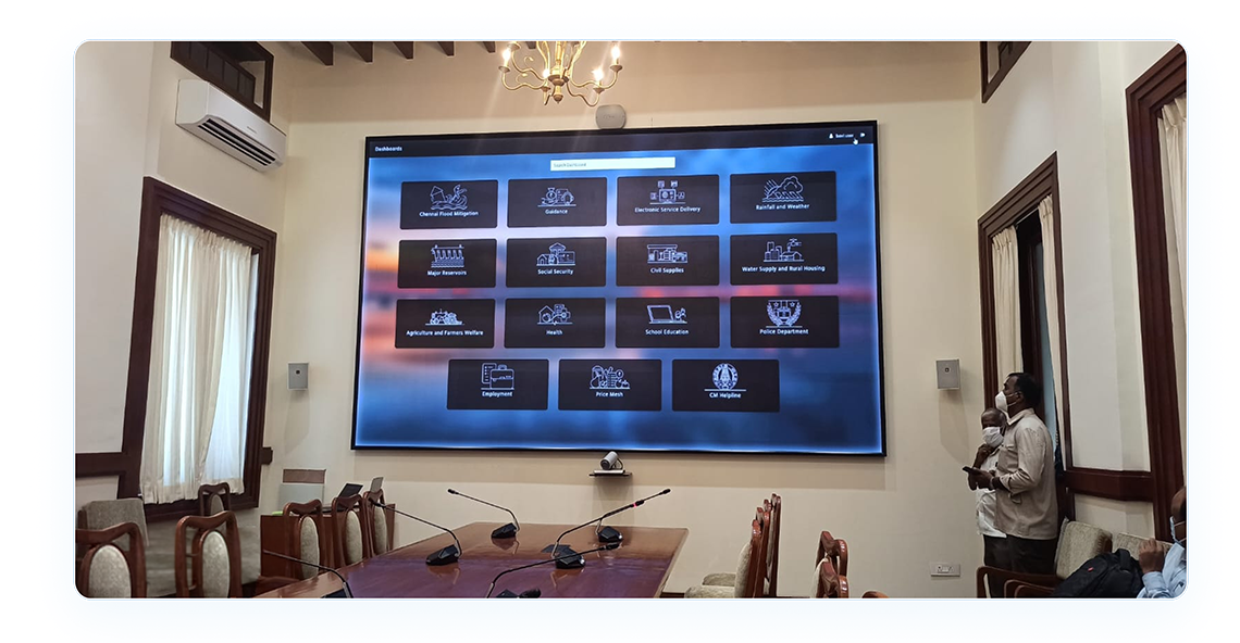
The hub screen presents all department dashboards as a searchable, icon-led grid. Each department tile has a distinct hand-crafted illustration reflecting its domain — Agriculture uses farmland iconography, Transport uses vehicles, Housing uses buildings. The dark, atmospheric background creates a high-contrast, screen-appropriate backdrop for conference room display. The visual language communicates authority and completeness — this is the full picture of Tamil Nadu governance, in one screen.
Mines & Minerals — Lease and Revenue Tracking
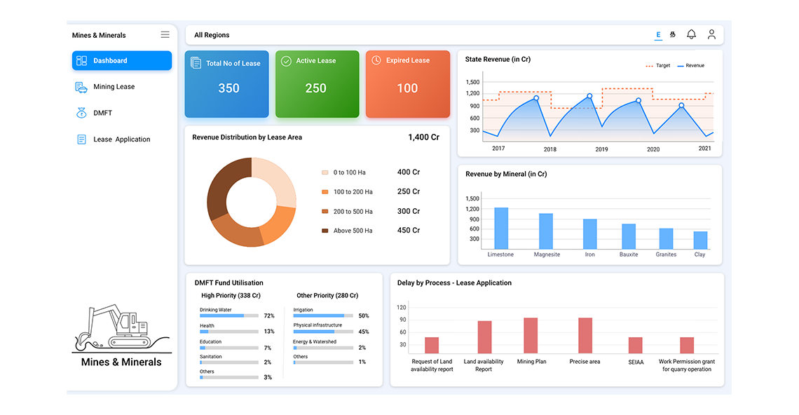
The Mines & Minerals dashboard tracks lease status, state revenue, mineral-wise revenue distribution, and process delays in lease applications. The light theme with blue accents creates a clean, data-dense layout that works at desktop scale. Three KPI tiles (Total Leases, Active Leases, Expired Leases) anchor the view with an instant status read. Revenue charts use target-vs-actual line charts to show performance trajectory against plan — a pattern replicated across all target-bearing departments.
PWD — Infrastructure Projects Dashboard
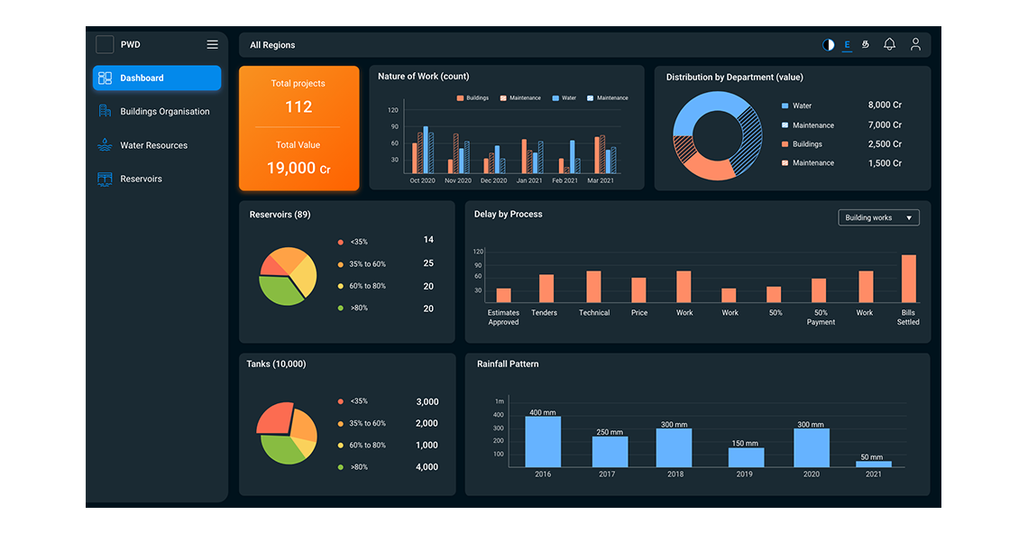
The Public Works Department dashboard covers buildings, water resources, and reservoir management across the state. The dark theme was chosen for this dashboard to serve the high-contrast requirements of large-format display — the warm orange accent on deep dark backgrounds gives immediate visual weight to the most critical KPIs. Pie charts for reservoir fill levels and bar charts for rainfall patterns use a carefully limited colour palette to avoid misinterpretation in data-dense layouts.
Education — Learning Outcomes Dashboard
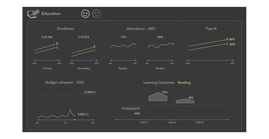
The Education dashboard presented a unique challenge: soft, outcome-based data (enrolment trends, pass percentages, learning outcomes) needed to feel as concrete and actionable as hard infrastructure metrics. I chose a dark chalkboard-inspired theme with neon-green accents — a purposeful reference to the educational context that also delivers excellent screen contrast. Sparkline-style trend charts keep the data density high without overwhelming a non-specialist audience.
Agriculture — Geospatial + Multi-domain Data
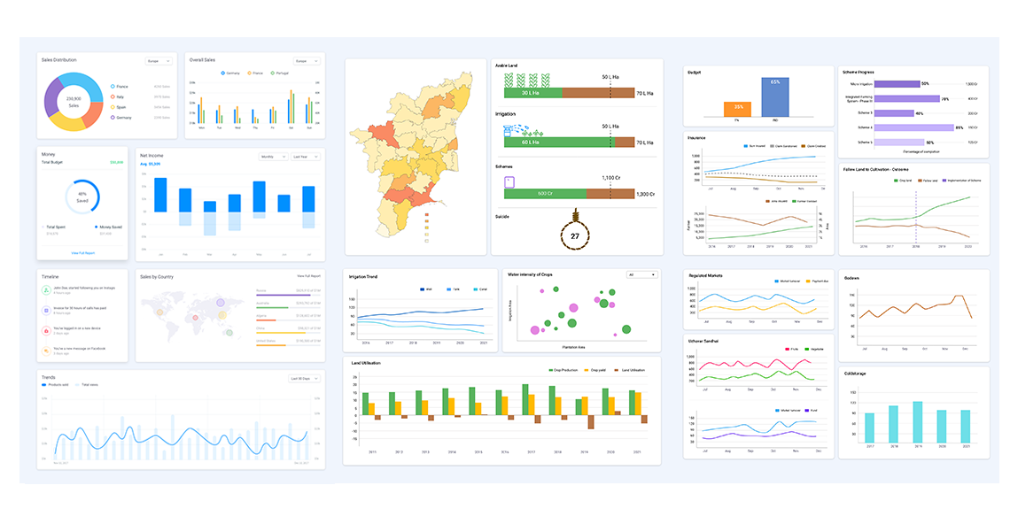
The Agriculture dashboard is the most visually complex — combining a live choropleth map of Tamil Nadu districts (colour-coded by crop/irrigation status), alongside land utilisation charts, irrigation trends, water intensity scatter plots, and market price tracking. This dashboard required the deepest chart design work: bubble charts, stacked area charts, and map-linked filtering interactions all had to cohere into a single coherent analytical surface.
In deployment — Tamil Nadu Secretariat
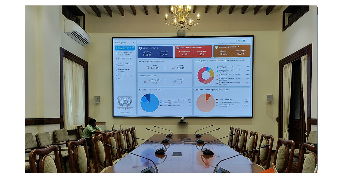
The dashboards are not just web products — they are physically deployed in government conference rooms, review meeting halls, and the Tamil Nadu Secretariat on large LED display walls. This context shaped every design decision: type sizes had to read clearly from 5 metres, chart areas had to be visually prominent from standing distance, and interface chrome had to recede so the data could dominate the screen.
Design System
With 40+ dashboards to build and a team of engineers implementing them in parallel, a robust design system was not optional — it was the only way to deliver at this scale without quality divergence. I built a comprehensive component library and visual language system that standardised every reusable element across the entire platform.
Components
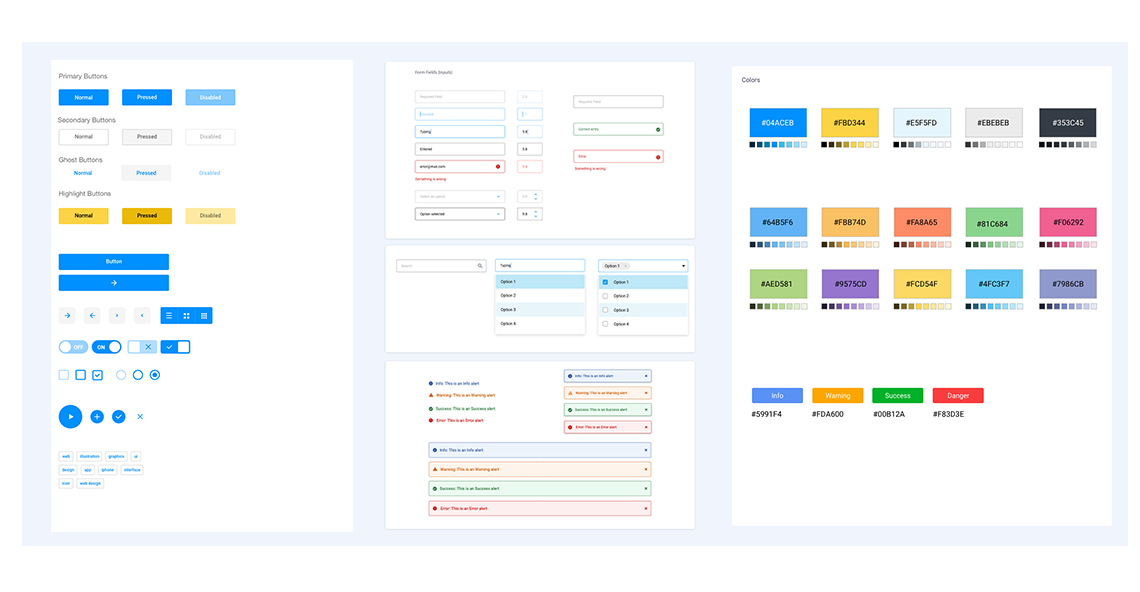
The system covers the full component spectrum: primary, secondary, ghost, and highlight button variants; form fields with all states (normal, active, error, disabled); pagination; toggles, checkboxes, and radio buttons; icon buttons; tags; and a complete alert/notification system with info, warning, success, and error states — both inline and dismissible toast variants.
Colour system
The colour palette was designed around two requirements: accessibility contrast compliance and thematic flexibility. A primary blue (#04ACEB) anchors the default light theme. A structured set of 15 functional colours supports department-specific theming — allowing each department dashboard to have a distinct visual identity while staying within the same system. All colours were tested for WCAG AA contrast compliance on both light and dark backgrounds.
Impact of the system
The design system became the multiplier that made the scale of this project achievable. Engineers could implement new dashboard screens without per-screen design consultation. QA could validate against system specifications rather than individual design files. The system reduced design-to-engineering handoff friction by approximately 40% and is now the foundation powering 600+ live dashboard screens across the Tamil Nadu government platform.
Outcomes
The GPMD platform is live and actively used in Tamil Nadu government review meetings and the Secretariat. It has become the reference data layer for performance review at the Chief Minister's Office — the authoritative source of truth when departments present their progress in review sessions.
The platform unified data from departments with wildly different technological maturity into a single coherent visual language — something previously considered technically and organisationally impossible. The design system built for this project became the standard visual framework for Peninsular Research Operations' entire GovTech portfolio.
Most significantly, the dashboards moved governance review culture from report-reading to data-seeing — a shift that reduces the time officers spend searching for information and increases the time they spend acting on it.
Learnings
Design for the room, not just the screen. Designing for large-format display forced a discipline that made every dashboard better — even the web versions. When type, contrast, and layout all have to work from 5 metres away, the resulting design is unambiguous at any distance.
Complexity is a systems problem, not a screen problem. The sheer scope of 40+ departments could only be handled through a disciplined design system. Without the system, each dashboard would have been a one-off. With it, they became a unified platform that got faster to build with every addition.
The source of truth is a trust problem. For the dashboards to be used in decision-making, officers had to trust them implicitly. Every visual design decision — clean layout, data accuracy indicators, real-time refresh timestamps — was in service of building that trust. A beautiful dashboard that people don't believe is worthless.
Government work demands humility about user context. Senior IAS officers, district collectors, and data-entry clerks are all "users" of this system — with entirely different contexts, pressures, and technical comfort levels. Designing for that range required constant pressure-testing of assumptions about what "obvious" means.
Data integration design is part of UX. The architecture of how data flows from departments to the screen is not an engineering-only concern. The form design for departments without existing systems, the schema decisions for API integration — these directly shape what the dashboard can show and how trustworthy the data feels. As the designer, being involved upstream made the downstream screens dramatically better.