Overview
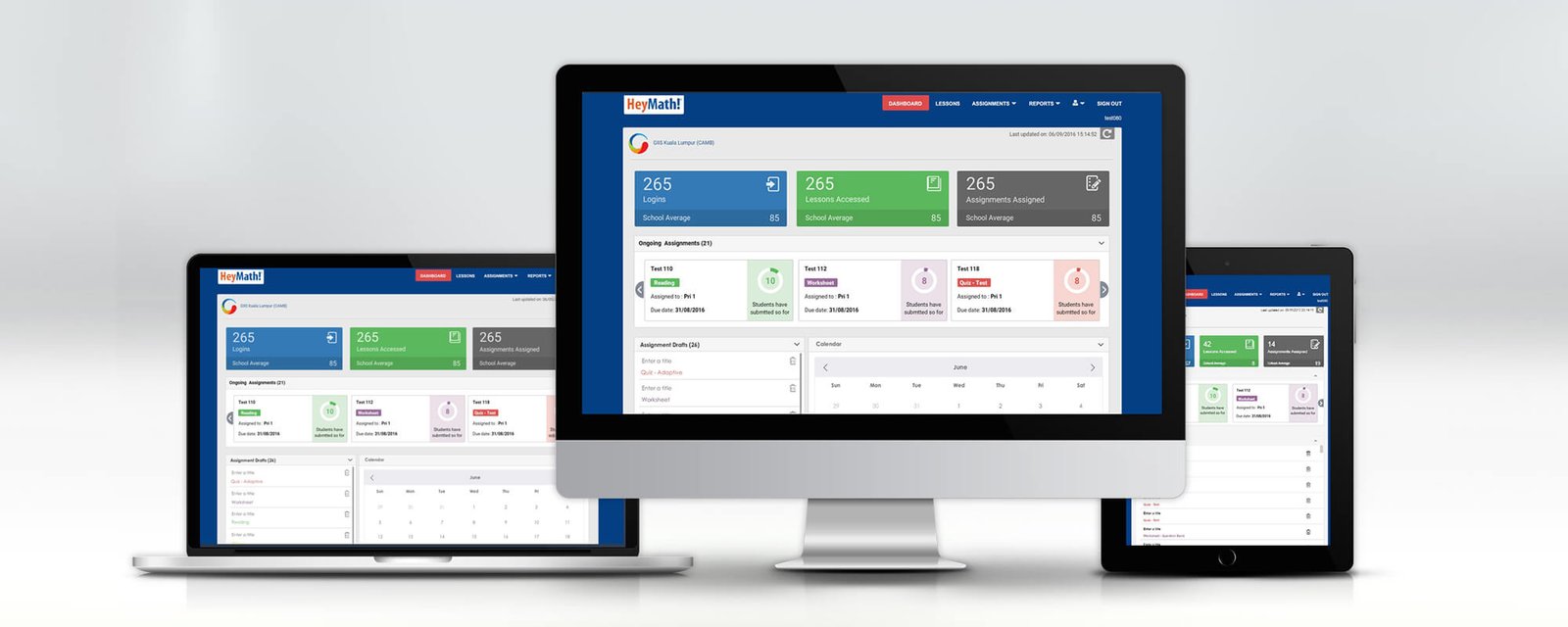
HeyMath! is an EdTech platform developed with support from the University of Cambridge, used by schools across 30+ countries. Its mission: make every student and teacher as effective as the world's best. The platform covers lessons, assignments, assessments, and performance reporting — all within a single web application.
As the sole designer for 10 years, I was responsible for the full design lifecycle of the teacher and administrator dashboard — Lumos — from initial concepts through to production QA and iterative improvement cycles. This included the web dashboard, responsive tablet views, and the multi-role permission system serving teachers, school admins, and district managers.
The Problem
Educators using HeyMath needed a single view of their class — how many students were active, which lessons had been completed, which assignments were due, and where individual students were struggling. This data existed but was scattered across disconnected reports.
As the platform grew, three distinct user roles emerged with different needs: the class teacher who needed daily operational insight, the school administrator who needed cross-class performance, and the district manager who needed comparative data across multiple schools.
"I know there's a report somewhere, but by the time I find it the class has already started."
Core pain points
Fragmented reports: Login stats, lesson counts, and assignment data lived in three separate sections with no unified view. Teachers navigated between screens to build a picture they needed in seconds.
No hierarchy for roles: Teachers and admins saw the same interface, even though their jobs required fundamentally different information densities and actions.
Tablet neglect: Many schools in emerging markets primarily accessed HeyMath via tablets. The web UI broke on smaller viewports — a significant accessibility failure for the core user base.
Research & Discovery
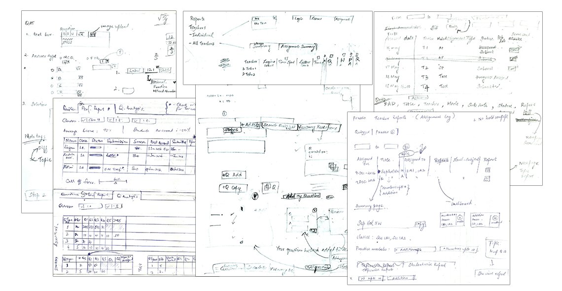
As the sole designer I wore the researcher hat as well. Over the 10 years I conducted ongoing user research through client visits, teacher interviews, and direct observation in classrooms across India, Malaysia, Singapore, and South Africa.
Key research methods
Contextual observation: Visited schools and observed teachers using the dashboard during actual class preparation. The most important insight came from watching — not asking. Teachers glanced at the screen for 10 seconds and moved on. The design needed to answer "what do I need to do today?" in one glance.
Role mapping: Mapped the mental models of teacher, school admin, and district manager using workshops with HeyMath's enterprise client relationships team. Each role had a completely different success metric — from individual assignment completion to district-wide curriculum coverage.
Client feedback synthesis: I served as the primary design-to-client bridge, synthesising feedback from enterprise clients including school districts, educational ministries, and private school groups. This gave me unfiltered user context that most designers never get access to.
Information Architecture & Structure
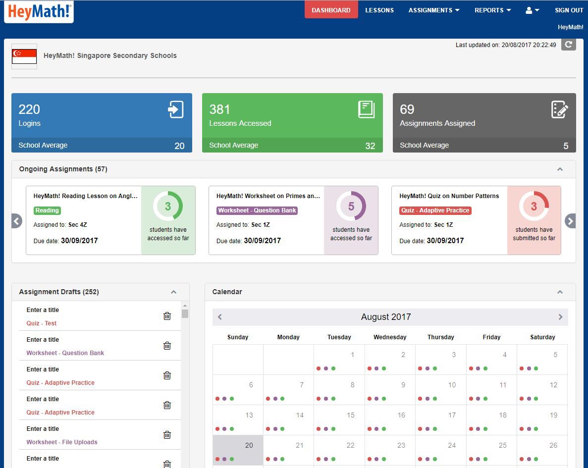
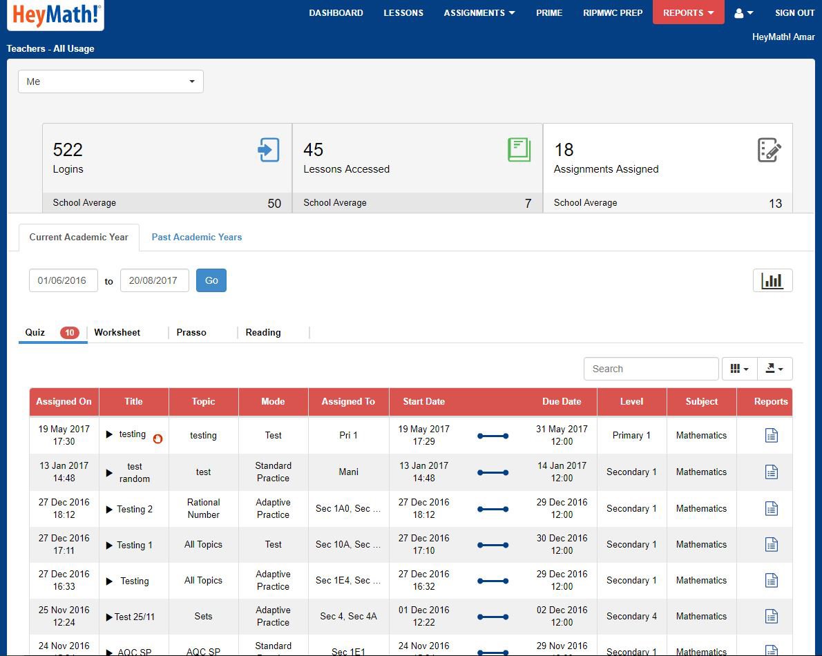
The central IA decision was: surface the summary first, drill-down second. The dashboard opened with three KPI tiles — Logins, Lessons Accessed, Assignments Assigned — each with a school average benchmark. Teachers could see in 3 seconds whether their class was tracking above or below the school norm.
Navigation model
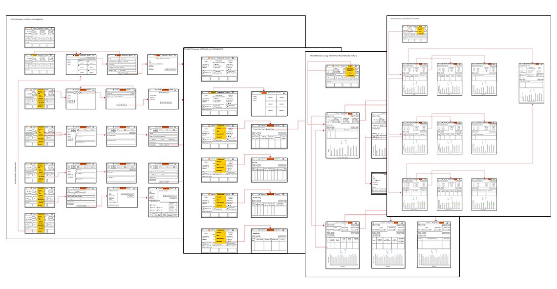
Structured around four primary workflows: Dashboard (today's overview), Lessons (content browsing and assignment), Assignments (creation, tracking, due dates), and Reports (historical performance). Each area was a distinct mental mode — switching between them was infrequent and deliberate.
Role-based access meant teachers saw their class; admins saw all classes with roll-up totals; district managers saw all schools. The same interface, three data scopes — users only saw what they could act on.
Design Execution
Dashboard — the command centre
The hero of the interface: three KPI tiles above the fold, each showing the current number alongside the school average. Colour-coded bands (green above average, amber at parity, red below) gave teachers an instant status read without needing to interpret numbers.
Below the fold: Ongoing Assignments as a card carousel (action-oriented — overdue, due soon), a Drafts area, and a Calendar — all the things a teacher needed to prepare for class in under two minutes.
Lessons
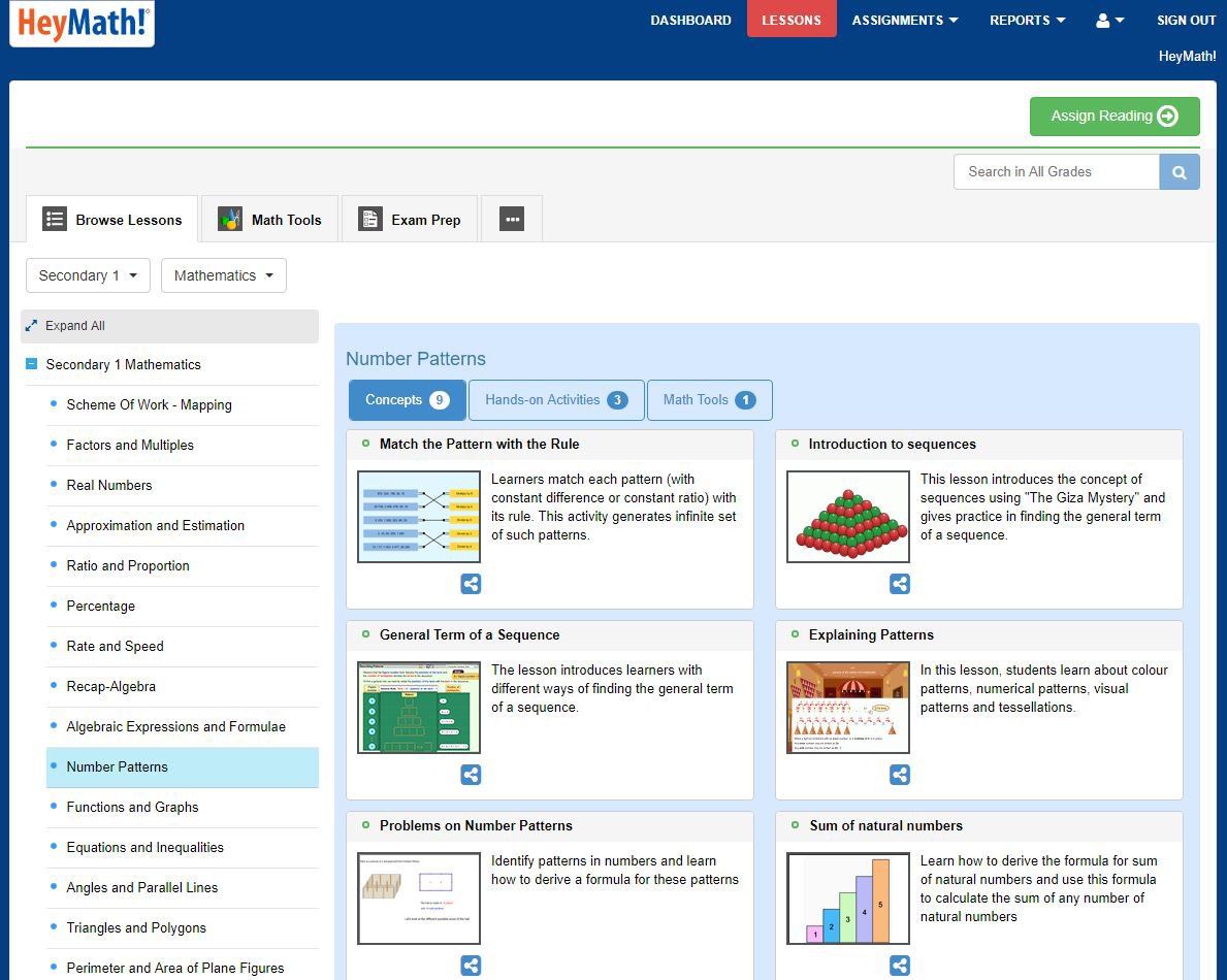
Browsable lesson library with curriculum-aligned tagging — teachers could filter by topic, grade, or concept type. Assignment creation was a single-click action from within the lesson view, reducing the friction that was causing teachers to skip the step entirely.
Reports
Designed a layered reporting system: class summary → student list → individual student detail. Each level answered a different question. Class summary: "How is my class doing?" Student list: "Who needs attention?" Individual: "What exactly does this student struggle with?"
Responsive design — tablet-first expansion
Rearchitected the layout system to work on 768px viewports (iPad) and 800px Android tablets. Cards reflow to single column, navigation collapses to a hamburger drawer, and tap targets are sized for touch. This opened the platform to schools in markets where tablets were the primary device.
Outcomes
Over the 10 years of iterative design and delivery, the Lumos dashboard became the primary engagement surface for HeyMath's enterprise relationships. School admins cited the dashboard as the deciding factor in renewal conversations. District clients specifically referenced the roll-up reporting as a capability competitors couldn't match.
As the sole designer I also maintained the design system, created all specification documentation, conducted QA against production builds, and ran design reviews with the engineering team. The discipline of operating alone built the systems thinking that shapes how I approach design at scale today.
Learnings
One glance is a design requirement. Teachers in the middle of their day have no patience for discovery. The dashboard had to answer "what do I need to do?" in under three seconds. That constraint became the guiding principle for every layout decision.
Roles are not personas. Teacher, admin, and district manager looked superficially similar but had entirely different success states. Designing for one "educator" persona would have failed all three. Role-based scope was the unlock.
Working solo forces systems thinking. With no other designers to share work, I had to build a personal design system — component patterns, naming conventions, spacing rules — just to stay consistent across versions. That discipline directly shaped the large-scale systems work I do today.
Client relationships are a research goldmine. Serving as the design-to-client bridge gave me research access that is rare for a designer. Real enterprise feedback — unfiltered, high-stakes — made every design iteration sharper.